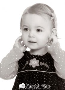
This black and white portrait was originally created in color. As my clients and I were viewing the portraits of their daughter I suggested that we take a look and see how this portrait would look in black and white.
I did this for a couple of reasons, the gentle, delicate expression on their daughter’s face and the high-key nature of the portrait (the all white background). In addition the soft, even lighting on her face I felt would lend itself to a nice rendition in black and white.
When I changed the portrait from color to black and white and they saw the difference they readily agreed with me that black and white was absolutely the way to go on their daughter’s portrait. Of course, once that decision is made it is my job in post production to create the file’s transition from color to black and white reproduce in the way that myself, as a portrait professional with 37 years experience believe is the best way.
One of my ‘secrets’ besides specifically controlling the contrast and the density (the lightness and darkness) of the image is to add a mixture of color (red and yellow, the amount of both) depending on the image, to give it the look that I want and that my clients will love.
There is a lot of subjectivity in this process which I really love. I compare to a cook or a baker that instinctively adds that one or two ingredients to their creation that just makes it ‘perfect.’
On last thing, I do not bombard my clients with recommendations for which poses should be black and white.
I always say and indeed, do believe that the image will tell us. What I mean by that is, when I click the image from color to black and white we will know right away by seeing the change if black and white is better or should we stay with color.
This is just one of the services I love to provide for my clients.


Recent Comments